Light in Photography: How To Add Luminosity To A Photo
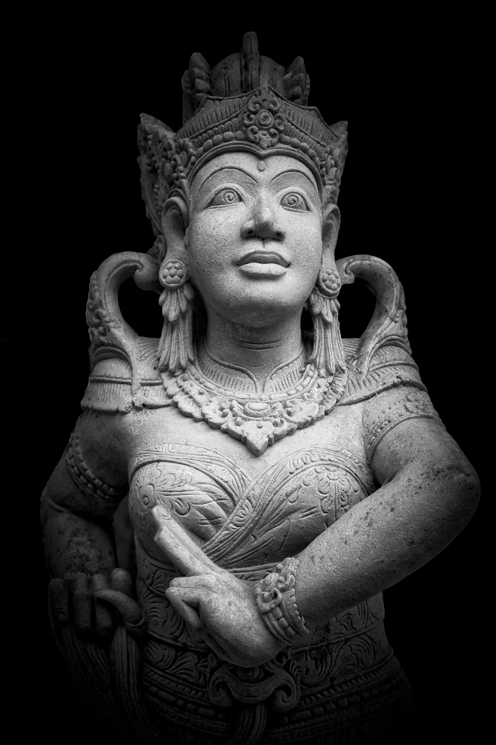
Luminous Hindu statue emerges from the darkness in Bali, Indonesia.
Luminosity and the concept of light in photography remains essential when crafting beautiful fine art prints. Here’s some relatively simple approaches I take to imbue my own photos with a greater sense of luminosity.
In photography, the term luminosity was most famously used by master landscape photographer, Ansel Adams, to describe a particular and quite mysterious quality exhibited in beautifully crafted photographic prints.
I’ve observed this phenomena as the appearance of light, seemingly radiating outwards from brighter areas within a print.
It’s subtle, but it’s there. The experience is something like the way light is transmitted, rather than reflected, through a stained glass window.
Take a look at this image of a murti, or Hindu statue, photographed in a temple complex in Bali, Indonesia.
I recognized immediately that the almost colorless, stone statue, illuminated against a much darker background, was a great candidate for rendering into black and white.
I used Adobe Lightroom for initial processing and conversion into black and white.
I then employed Adobe Photoshop for some local burning to push any remaining details in the background into black.
By significantly darkening the background I've removed potentially distracting elements, helping to draw attention to the statue, and given the impression that it’s moving forwards, out of the blackness that surrounds it.
That’s a powerful metaphor, which works equally well when photographing people, animals, flowers, clouds and all manner of inanimate objects.
The final touch was the addition of color through a serious of subtle warm tones into the shadows, midtowns and highlights.
It’s not important that you see those colors, as they’re deliberately subtle. But color effects mood and the idea here is to add color to influence viewer response.
Warm colors, even when subtle, bring positivity and, in some cases, a sense of hope to a photo.
Conversely, images with a predominantly cool color palette allow us to explore notions of sadness, melancholy and alienation through the photos we create.
Techniques that Enhance Luminosity
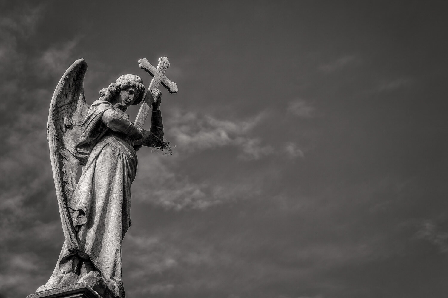
The rest of the photos featured in this post were made in La Recoleta Cemetery in Buenos Aires, Argentina.
For those photos I decided to add more color into the original black and white images. That’s because I felt the heavier levels of color enhanced the communicative power of those particular photos.
If you compare all three photos in this post, you’ll notice that the image at the very top relies more on contrast and luminosity to evoke mood and atmosphere.
However, when it came to processing the images made at La Recoleta Cemetery, I felt a slightly different treatment was required.
I opted for a reduced brightness range and the addition of more color into the final images.
I believe that approach has been helpful in retaining the subtle tone and textural qualities evident in the brighter areas of the angel statues and surrounding clouds.
That’s because I wanted to ensure that the angel statues remained the most important visual, narrative and thematic elements within these pictures.
Adapting your post processing to the needs of the image, rather than following a particular recipe each and every time you process a photo, is an important element for fine art photographers.
It’s also a major distinction between the notions of art and craft, regardless of the discipline or media in question.
Luminosity and the Joy of Transmitted Light
Back in the days of film based photography, a transparency or slide would commonly be viewed by transmitted light, either projected on screen or viewed on a light box.
These days computer monitors also allow us to view our digital files by transmitted light.
Regardless, whether a print is produced in a traditional darkroom or via a digital printer, it’s going to be viewed by reflected light.
When we look at a print some of the light is scattered as it reflects from the paper surface back towards the eye. This phenomena is particularly evident in papers with non-gloss (e.g., matte) surfaces.
The stronger the tooth or texture on the surface of the paper, the more light is scattered, resulting in a loss of sharpness and color saturation in the resulting print.
Is this a bad thing? Well, that all depends.
It’s important to examine statements many people make about their preference for matte or gloss papers.
Reflections can certainly distract from the experience of looking at a high gloss print. I think that’s undeniable.
However, it’s important to base your decision of which paper surface to choose around the actual needs of the image in question.
Think about what it is that you’re trying to communicate and whether a particular paper surface will help or hinder the idea, metaphor or mood in question.
If you’re looking to explore notions of mystery, nostalgia or whimsy, for example, then there’s something to be said for limiting information within an image.
Imagine a mist shrouded landscape as a case in point. That’s probably a good candidate for a paper with a heavy matte surface.
What about a pleasing portrait of an elderly person with wrinkled skin?
Sometimes the texture of the paper, particularly in the case of canvas, can add more texture than needed to the image.
Frankly, when the viewer’s eye is drawn to the paper’s surface, rather than the scene or subject in question, you may well have a problem.
Conversely, if you looking to produce a super sharp and colorful image of an autumn/fall landscape, revealing as much color and detail as possible, then a gloss paper is your best option.
Ultimately, it’s a decision for you to make.
But my advice is not to let any preconceived bias or prejudices lead you to a decision that’s not in harmony with the needs of the actual image in question.
Light in photography evident in this angel statue, La Recoleta Cemetery, Argentina.
How to Make a Luminous Black and White Darkroom Print
Back in the day the creation of a luminous black and white darkroom print would involve the following:
Good lighting and exposure of the original subject or scene.
Careful exposure and processing of the film.
Optimal exposure and processing of the print to ensure well separated mid tones and highlights.
Local contrast control via selective dodging and burning to lighten and darken specific areas within the print.
Correct processing of the paper to achieve optimal results.
Local bleaching to chemically lighten certain areas of the print.
Personally, I loved this step as I found it produced more of a luminous look than simply minimizing the amount of light hitting the print via dodging.
Chemical toning to increase print longevity and, often, to intensify blacks.
As a consequence of making the blacks appear visually deeper and more intense, the lightest areas of the print would appear more luminous.
Archival washing of the final photographic print.
It’s worth noting that, what master landscape photographer Ansel Adams was referring to as luminosity, was the apparent presence of light emitting outwards from the print.
This is, of course, an illusion as prints are viewed by reflected rather than transmitted light.
Nonetheless, a beautifully produced print does seem to display this mysterious, luminous quality which I feel is central, at least historically, to the nature of the fine art print tradition.


This is the best photography course in Melbourne. Learn photography, master your camera and realize your creative potential by making beautiful, life affirming images.
I’m Glenn Guy, an experienced teacher and owner of the Travel Photography Guru website and blog.
Here’s the private photography course that’s specially designed around your needs, your camera and the photos you most want to create.
Appreciating Luminosity in a Black and White Print
These days software applications, like Adobe Lightroom and Adobe Photoshop, can be used to simulate the effect of luminosity in a print.
But you can't hope to achieve the effect unless you know what it is I'm taking about.
Could I suggest that, over time, you do all you can to visit major galleries in big cities and actually view prints made by luminaries such as these master fine art photographers:
It's okay to do some initial research on the web, and the above links will help you do so, but that will only provide you with a virtual experience.
To my mind the viewing of great black and white prints is akin to a spiritual experience and, therefore, well worth the effort to do so in person.
While not exactly a hands on experience, the opportunity for an aspiring, creative photographer to view a classic, fine art black and white print is an opportunity that just shouldn’t be missed.
I really hope you’ll be able to further explore the concept of luminosity in your own photography.
In the meantime, please feel free to share this post widely and wildly.