How To Make Great Color Photos
Garish colors reign supreme in this close up study of Hindu deities on the front of a shrine in Chennai, India.
I love black and white photography, but I'm also a huge fan of color. For a color photograph to work and impact the viewer, on an emotional level, color needs to be dominant in the photograph.
The above image is all about color. It features a detail from the facade of a Hindu Shrine in Chennai, India.
What feels like a potentially chaotic scene has been brought together, in a way that makes sense, by the repetitive nature of the symmetrical structures onto which color has been applied. This photo simply concentrates attention on these relationships.
While the placement of the statues further helps to cement the notion of stability within the image, it's the colors that most folks will be drawn to. But it's my contention that it's the structural elements within the image that hold those colors together and produce a cohesive result.
Next time you're out and about with your camera try making some photos that incorporate the following:
A vivid yellow structure makes for a powerful visual statement to folks traveling along the Tullamarine Freeway in Melbourne, Australia. This image is based around the notion of complimentary colors.
How To Excite Your Audience With Color contrast
The term color contrast describes the juxtaposition of contrasting primary and complimentary colors, which sit directly opposite each other on the color wheel. In each case you're contrasting a warm color against a cool color. Here are the colors illustrated on the photographers' color wheel.
There Is Power In The Relationship Of Opposites
Primary | Complimentary Colors
- Red | Cyan
- Green | Magenta
- Blue | Yellow
A view down a stone corridor at Helligenkreuz Abbey in Austria. This image is based around the notion of harmonious color.
Stunning Harmonious Color Will Engage Your Audience
In this case the color palette of your image is based around colors that are adjacent to each other on the color wheel. These colors could either be warm or cool, rather than a combination of both.
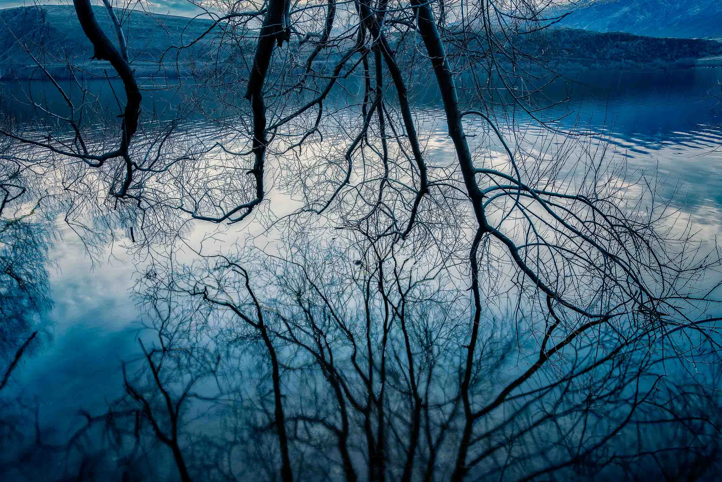
A ornately carved statue of a lion on the tomb of Charles the Bold in the Church Of Our Lady, Brugge, Belgium. This image is a great example of monochromatic color.
Powerful Results By Using Strong, Monochromatic Color
Monochromatic images are based around a single color, often displaying variations of brightness throughout the image.
Images that are based around contrasting colors tend to be dynamic while those featuring harmonious colors tend to produce quieter, more subtle images.
However, monochromatic color has the potential to produce very emotive images that explore a variety of moods, emotions and concepts including the following:
- serenity
- tranquility
- anger
- lust
- nature
- religion
- royalty
Graphic designers, painters and advertising creatives have long understood the power of color to communicate and persuade their audience.